A Strategic Design Overhaul: The Power of Simplicity
When we were approached by a local startup with a modest budget of $500 for a rebrand, we knew that a visual transformation could change how they were perceived in their industry. Our goal was to create a brand identity that was not only visually appealing but also communicated a sense of trust, professionalism, and high-quality service that would resonate with a larger audience. By focusing on clean, modern design elements and strategic typography, we were able to create a sophisticated look that positioned the brand to appear like a Fortune 500 company.
\”A brand is not just a logo—it\’s the story you tell, the trust you build, and the experience you deliver.\”
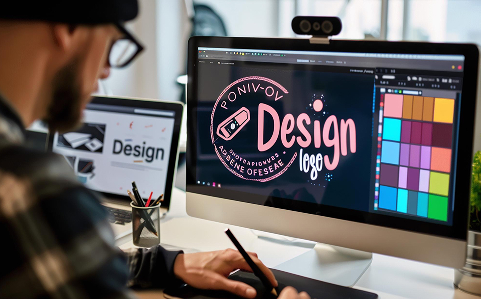
Brand Identity: Less Is More
In a crowded marketplace, it’s often the brands that simplify their messaging that stand out the most. The client’s previous logo was cluttered and didn’t communicate their core values effectively. By focusing on a minimalist approach, we created a sleek, simple logo that spoke volumes about the brand’s vision and values. The refined color palette and crisp typography gave the brand an elevated, high-end feel—one that aligns with the company’s aspirations and market position.
The visual overhaul included redesigning the website to match the new branding. We created a responsive, modern design that improved user experience and engagement. The layout was simplified to highlight key information and make navigation easier.